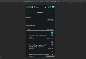
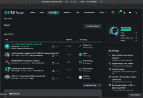
Experimental Dark Theme

  • For those that prefer the dark, we have added an alternative dark theme to the forum.


    To enable you need to go to the the user menu in the top menu and click on 'Manage Your Account', then select 'General' from the right hand side under 'Settings and Privacy' heading.


    You will see the 'Style' dropdown...


    Select 'Dark' and click save.


    Let me know of any issues and what you think, all constructive feedback is welcome.


    You can switch back to the original theme anytime by selecting 'Default'


    UPDATE: for users that have not read this before, the dark theme is now named 'Dark Theme'

  • I noticed that the red/blue coloring of read/unread messages in the threads disappeared in the dark theme. That’s a show stopper for me, but otherwise I would love to use dark theme instead 🤩

  • Thanks for pointing that out. Can you tell me which page this is on or send a screen grab. This is not something I have seen and should be able to fix.


  • Looks very nice Pete. Big question, what's it like on a mobile phone do you think?

    Sorry have not tested mobile as my phone browser enforces a dark mode and it looks terrible with old theme. I will try on Chrome.

    UPDATE: i see the fonts are too big, have fixed that. I still need to correct the colours for unread and updated messages on desktop and mobile.

  • Sorry have not tested mobile as my phone browser enforces a dark mode and it looks terrible with old theme. I will try on Chrome on my phone when i get a chance

    As I visit the site mostly from my mobile I just now was able to see it in action and is visually atractive but the larger font means more scrolling. I also see it has the issue of not having a different font color for threads that have been updated since the last visit, and thus one might miss an update.

    I certainly Hope to see LENR helping humans to blossom, and I'm here to help it happen.

  • Thanks. I have made some amends with font sizes but needs a lot of work still. I was not even aware of the different colors for updated / unread posts. I will wait for some updates on posts so I can see that.


    I will work on it more this week and post an update once ready.


  • If you notice the last topic is in blue (Seeking design…), while the others are red, meaning that there are unseen replies entries in those topics. In dark mode (love it!) they’re all white. Perhaps white/light grey could be good as an alternative? Or bold/regular font size?

  • Looks great. I prefer it to Radiant. A couple of very minor quibbles on a smaller screen (1280 x 800).


    Whilst I can see that the layout looks great on a larger screen, on a smaller screen it is a little crowded. The side panel takes up a lot of real estate, and creates a lot of dead space beneath it.


    Also, the user avatars are much larger (in a relative sense) than they are on a larger screen, and take up more real estate. I'm not actually averse to this, but it's worth pointing out, nonetheless.

  • Thanks orsova, I should be able to fix those issues.


    I notice the Bastelstu.be 404 issue, not sure what that is but will fix. Could be from an older version of the forum software.

  • I've made some updates. I've removed the right side bar for screens 1200 or less and added space around avatars next to posts on mobile...


    It's almost there. I will test on more devices. Apologies for not doing that before.


    Thanks for your input and patience!

  • I'd just be happy with a simple "high contrast text" option (i.e. black text instead of various shades of grey) on the normal theme (like this comment).


    Note that as eyes age (50+) the ability to differentiate different shades of grey deminishes - whereas colour differentiation generally stays about the same.


    Unfortunately, there seems to be a current trend in web page design to use grey text on a grey background, with only a small contrast in shades. This may look "cool" to younger people - but for older people (even those with sharp eyesight) the grey text can be difficult to read.


    I also suspect the average age of forum users is fairly high.

    "The most misleading assumptions are the ones you don't even know you're making" - Douglas Adams

  • Point taken, will see what I can do. I am closer to 50 than 40 and will need glasses soon if not already!


    I could also add a theme for colour blindness where reds and blues are seen as only shades of greys.

Subscribe to our newsletter

It's sent once a month, you can unsubscribe at anytime!

View archive of previous newsletters

* indicates required

Your email address will be used to send you email newsletters only. See our Privacy Policy for more information.

Our Partners

Supporting researchers for over 20 years
Want to Advertise or Sponsor LENR Forum?
CLICK HERE to contact us.